- Area: 2940 m²
- Year: 2011
-
Photographs:Günter Richard Wett
-
Manufacturers: Metall Ritten Srl
Text description provided by the architects. It was and is our aim to give the „non-architectural“ winery from the 1960s a new overall picture and at the same time create a unity. The newly added parts symbolize the development and technology of modern time and should be recognized as such. They could be compared to the philosophy of the winery where the progress of growing wine is the focal point. On the one hand there is the oak-facade following the storage in oak barrels. On the other hand there is the metal façade made of expanded metal because of the use of metal barrels. These two facades open the way for a new unity and a new situation on the farmyard.

Let’s now come to the oak facade: the existing façade of the winery remained unaltered in its shape and its window cases. A new structure was placed in front of it at a distance of 50 cm – a structure of metal and wood which plays with spacings, openings, colours and shadows. The result is a 45 metre long and 9m high linear body, which was consciously structured into three parts. Within this trisection a game with distances and spaces is strived for in order to achieve a unique rhythm and at the same time surprising plasticity compared to the flat appearance of the previous façade.

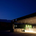
On the opposite side there is the curtain-wall façade made of black painted expanded metal panels which again play with distances and heights. By selecting different wire widths a game with light is moreover allowed. The material used, if looked at from the side, appears like a varnished black wall, but if observed from the front, the old building becomes visible. It’s again a play where you see and don’t see at the same time.

This metal facade surrounds the old building like a clamp and follows the entire facade. The space in between varies according to the located amount of technical equipment (like pipes) which updates the winery and its technology. The wall – the clamp begins at the entrance gate – runs along the façade and becomes a string which jumps for- and backwards, then transforms into a canopy jutting out extensively and receding again into a wall and then clamp.

Together with the artist Philipp Messner from Munich, circular areas made of polished INOX - which resemble mirrors - were installed as single and group constellations in different heights and positions on the façades. These reflective surfaces result in a kind of break in the architectural façade comparable to the old and new architecture of the building. Because of the observer’s movement the projection surface constantly changes, from little distortions in the reflective areas up to day and night as well as weather related motions of the sky. These circular areas symbolizing the grapes again create a unity and are a repetitive pattern along the entire facades – old as well as new.

The characteristics of the two materials, wood and steel, become the architectural element, for the surface as well as the form. The design is lived, whereas the existing building is pushed into the background. A confrontation of two materials, which are closely connected to the winery, is created: steel and wood are joined together in the colour black and the nature. The plants on the farmyard are on the one hand geometrically cut, and therefore tamed, on the other hand the steel structure symbolizes the open and unrestrained.

As a total this results in a fusion of material (steel – wood) of the colour black and of the restrained and open nature. In the courtyard the material – steel and wood – tames the “non-architecture”. Along the street nature grows exuberantly over the façade - we could therefore also say that the material and the nature help each other.


